
CSS Маскування
За допомогою маскування CSS ви створюєте шар маски, який розміщуєте над елементом, щоб частково або повністю приховати частини елемента.
CSS властивість mask-image
Властивість CSS mask-image визначає зображення шару маски.
Зображення шару маски може бути зображенням PNG, зображенням SVG, CSS градієнт або SVG <mask> елемент.
Підтримка браузерами
Примітка: Більшість браузерів мають лише часткову підтримку маскування CSS. Вам потрібно буде використовувати префікс -webkit- на додаток до стандартної властивості в більшості браузерів.
Числа в таблиці нижче вказують на першу версію браузера, яка повністю підтримує властивість. Цифри, за якими йде -webkit-, вказують на першу версію, яка працювала з префіксом.
| Property | |||||
|---|---|---|---|---|---|
| mask-image | 4.0 -webkit- | 79.0 -webkit- | 53.0 | 4.0 -webkit- | 15.0 -webkit- |
Використовуйте зображення як шар маски
Щоб використовувати зображення PNG або SVG як шар маски, використовуйте значення url(), щоб передати зображення шару маски.
Зображення маски має мати прозору або напівпрозору область. Чорний означає повну прозорість.
Ось зображення маски (зображення PNG), яке ми будемо використовувати:

Ось фото з Чінкве-Терре, Італія:
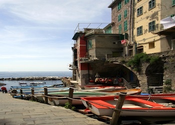
Тепер ми застосовуємо зображення маски (зображення PNG вище) як шар маски для зображення з Чінкве Терре, Італія:
Приклад
Ось вихідний код:
.mask1 {
-webkit-mask-image: url(w3logo.png);
mask-image: url(w3logo.png);
-webkit-mask-repeat: no-repeat;
mask-repeat: no-repeat;
}
Спробуйте самі »
Пояснення прикладу
Властивість mask-image визначає зображення, яке використовуватиметься як шар маски для елемента.
Властивість mask-repeat визначає, чи повторюватиметься зображення маски та як саме. Значення no-repeat вказує, що зображення маски не повторюватиметься (зображення маски буде показано лише один раз).
Інший приклад
Якщо ми опустимо властивість mask-repeat, зображення маски повторюватиметься на всьому зображенні з Чінкве-Терре, Італія:
Приклад
Ось вихідний код:
.mask1 {
-webkit-mask-image: url(w3logo.png);
mask-image: url(w3logo.png);
}
Спробуйте самі »
Використовуйте градієнти як шар маски
Лінійні та радіальні градієнти CSS також можна використовувати як зображення маски.
Приклади - Лінійний градієнт
Тут ми використовуємо лінійний градієнт як шар маски для нашого зображення. Цей лінійний градієнт йде від верху (чорний) до низу (прозорий):
Приклад
Використовуйте лінійний градієнт як шар маски:
.mask1 {
-webkit-mask-image: linear-gradient(black, transparent);
mask-image: linear-gradient (black, transparent);
}
Спробуйте самі »
Тут ми використовуємо лінійний градієнт разом із маскуванням тексту як шар маски для нашого зображення:
Чинкве-Терре — це прибережна територія в Лігурії, на північному заході Італії. Він розташований на заході провінції Спеція та складається з п’яти сіл: Монтероссо-аль-Маре, Вернацца, Корнілья, Манарола та Ріомаджоре.
Чинкве-Терре — це прибережна територія в Лігурії, на північному заході Італії. Він розташований на заході провінції Спеція та складається з п’яти сіл: Монтероссо-аль-Маре, Вернацца, Корнілья, Манарола та Ріомаджоре.
Чинкве-Терре — це прибережна територія в Лігурії, на північному заході Італії. Він розташований на заході провінції Спеція та складається з п’яти сіл: Монтероссо-аль-Маре, Вернацца, Корнілья, Манарола та Ріомаджоре.
Приклад
Використовуйте лінійний градієнт разом із маскуванням тексту як шар маски:
.mask1 {
max-width: 600px;
height: 350px;
overflow-y: scroll;
background: url(img_5terre.jpg) no-repeat;
-webkit-mask-image: linear-gradient(black, transparent);
mask-image: linear-gradient (black, transparent);
}
Спробуйте самі »
Приклади - Радіальний градієнт
Тут ми використовуємо радіальний градієнт (у формі кола) як шар маски для нашого зображення:
Приклад
Використовуйте радіальний градієнт як шар маски (коло):
.mask2 {
-webkit-mask-image: radial-gradient(circle, black 50%, rgba(0, 0, 0, 0.5) 50%);
mask-image: radial-gradient(circle, black 50%, rgba(0, 0, 0, 0.5) 50%);
}
Спробуйте самі »
Тут ми використовуємо радіальний градієнт (у формі еліпса) як шар маски для нашого зображення:
Приклад
Використовуйте інший радіальний градієнт як шар маски (еліпс):
.mask3 {
-webkit-mask-image: radial-gradient(ellipse, black 50%, rgba(0, 0, 0, 0.5) 50%);
mask-image: radial-gradient(ellipse, black 50%, rgba(0, 0, 0, 0.5));
}
Спробуйте самі »
Використовуйте SVG як шар маски
Елемент SVG <mask> можна використовувати всередині графіки SVG для створення ефектів маскування.
Тут ми використовуємо елемент SVG <mask> для створення різних шарів маски для нашого зображення:
Приклад
Шар маски SVG (у формі трикутника):
<svg width="600" height="400">
<mask id="svgmask1">
<polygon fill="#ffffff" points="200 0, 400 400, 0 400"></polygon>
</mask>
<image xmlns:xlink="http://www.w3.org/1999/xlink" xlink:href="img_5terre.jpg" mask="url(#svgmask1)"></image>
</svg>
Спробуйте самі »
Приклад
Шар маски SVG (у формі зірки):
<svg width="600" height="400">
<mask id="svgmask2">
<polygon fill="#ffffff" points="100,10 40,198 190,78 10,78 160,198"></polygon>
</mask>
<image xmlns:xlink="http://www.w3.org/1999/xlink" xlink:href="img_5terre.jpg" mask="url(#svgmask2)"></image>
</svg>
Спробуйте самі »
Приклад
Шар маски SVG (у формі кіл):
<svg width="600" height="400">
<mask id="svgmask3">
<circle fill="#ffffff" cx="75" cy="75" r="75"></circle>
<circle fill="#ffffff" cx="80" cy="260" r="75"></circle>
<circle fill="#ffffff" cx="270" cy="160" r="75"></circle>
</mask>
<image xmlns:xlink="http://www.w3.org/1999/xlink" xlink:href="img_5terre.jpg" mask="url(#svgmask3)"></image>
</svg>
Спробуйте самі »
CSS Властивості маскування
У наступній таблиці перераховано всі властивості маскування CSS:
| Властивість | Опис |
|---|---|
| mask-image | Укажіть зображення, яке буде використовуватися як шар маски для елемента |
| mask-mode | Укажіть, чи розглядається зображення шару маски як маска яскравості чи як альфа-маска |
| mask-origin | Укажіть початкове положення (область положення маски) зображення шару маски |
| mask-position | Установіть початкове положення зображення шару маски (відносно області положення маски) |
| mask-repeat | Укажіть спосіб повторення зображення шару маски |
| mask-size | Укажіть розмір зображення шару маски |
